Are you looking to visually represent your run times in a clear and organized manner? Creating a bar graph is an effective way to present your data in a visually appealing format. This guide will provide you with step-by-step instructions on how to create a bar graph of your run times. By following these instructions, you will be able to accurately display your data and gain valuable insights from the results. Whether you are an avid runner or simply interested in tracking your progress, this guide will help you showcase your achievements in a professional and visually appealing manner. So let’s get started on creating a bar graph that accurately reflects your run times!
Key Takeaways
- Consider factors such as ease of use, customization options, and data input flexibility when selecting a tool for creating a bar graph of run times.
- Collect and organize your run time data systematically using a spreadsheet or table, including columns for date and run time, to allow for effective analysis and visualization.
- Create a data table in Excel or Google Sheets by labeling columns appropriately and entering run time data into corresponding cells.
- Select the appropriate chart type, such as a bar graph, for comparing run times and showing progression, considering the nature of your data and the message you want to convey.
Choosing the Right Tool for Creating a Bar Graph
To create an accurate bar graph of your run times, it is essential to carefully select the appropriate tool for visualization. The choice of tool will determine the clarity and effectiveness of your graph in conveying the information to your intended audience. There are various software and online platforms available that offer bar graph creation capabilities.
It is important to consider factors such as ease of use, customization options, and data input flexibility when choosing the right tool. Additionally, consider the specific features you require, such as the ability to add labels, axis titles, and data labels. By selecting the right tool, you can create a visually appealing and informative bar graph that effectively presents your run times to your audience.
Collecting and Organizing Your Run Time Data
To collect and organize your run time data, start by recording the specific duration of each run. This can be done by using a stopwatch or a running app that tracks your time. Make sure to note down the time in minutes and seconds for accuracy. Once you have recorded the duration of each run, organize the data in a spreadsheet or a table. Create columns for the date of the run and the corresponding run time.
This will allow you to easily refer back to your data and compare your run times over time. Additionally, consider adding any relevant notes or factors that may have influenced your performance, such as weather conditions or terrain. By collecting and organizing your run time data in a systematic manner, you will be able to effectively analyze and visualize your progress using a bar graph.
Creating a Data Table in Excel or Google Sheets
Once you have collected and organized your run time data, the next step is to create a data table in Excel or Google Sheets. This table will serve as the foundation for creating a bar graph of your run times. To create a data table, follow these steps:
- Open Excel or Google Sheets and create a new spreadsheet.
- Label the columns with the appropriate headers, such as “Date,” “Distance,” and “Time.”
- Enter your run time data into the corresponding cells of the table.
- Format the table by adjusting the column widths and applying any desired formatting options.
Creating a data table will allow you to easily reference and analyze your run time data. It provides a clear overview of your runs and serves as a basis for creating visual representations, like bar graphs, to track your progress over time.
Selecting the Appropriate Chart Type for Your Data
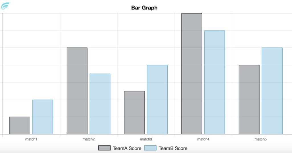
After creating a data table of your run times, the next step is to select the appropriate chart type to visually represent your data. The choice of chart type depends on the nature of your data and the message you want to convey. In the case of run times, a bar graph is a common and effective choice.
A bar graph allows you to compare the different run times easily by displaying them as vertical bars. This type of chart is particularly useful when you have multiple run times to compare or when you want to show the progression of your times over a period. The next section will guide you through the process of inputting your run time data into the chart, ensuring that your graph accurately represents your performance.
Inputting Your Run Time Data Into the Chart
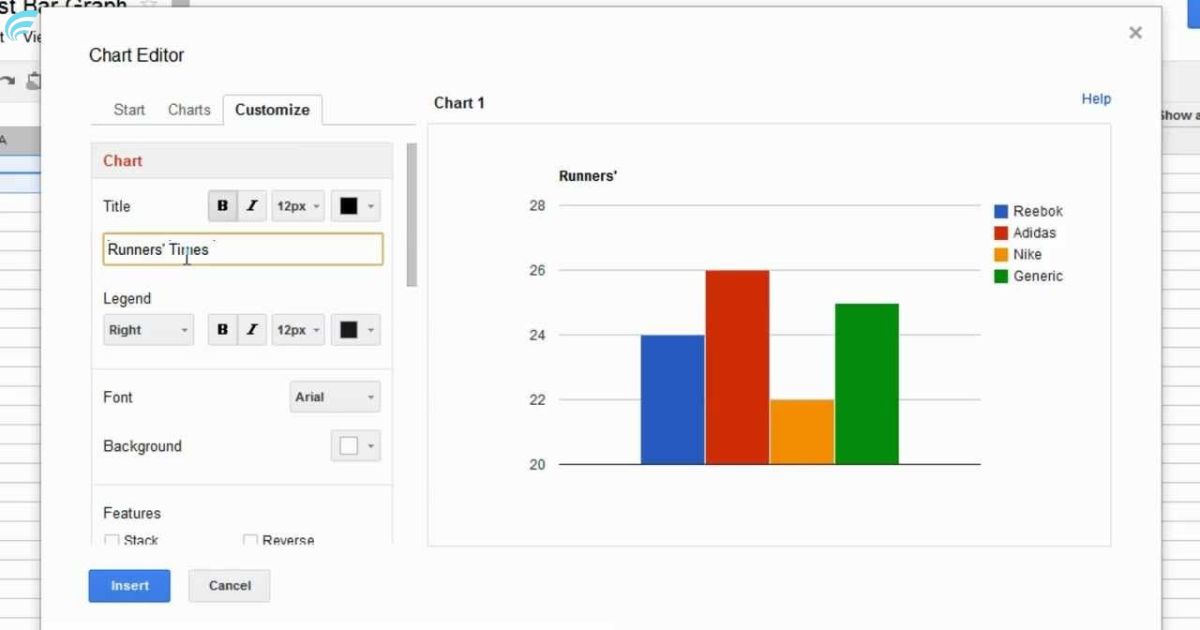
In the process of creating a bar graph of your run times, the next step involves inputting your run time data into the chart. This step allows you to visually represent your run times in a clear and organized manner. To input your run time data into the chart, follow these steps: – Begin by opening the chart software or application you are using. – Locate the data input section, which is usually labeled or identified as “data” or “values.” – Enter your run time data into the designated cells or fields. Each run time should be entered in a separate cell or field. – Double-check the accuracy of your data input to ensure the chart accurately reflects your run times.
Customizing the Appearance of Your Bar Graph
To customize the appearance of your bar graph, start by selecting the appropriate formatting options in your chart software. Most chart software programs offer a range of customization features that allow you to modify the colors, labels, and overall design of your graph. Begin by choosing a color scheme that is visually appealing and easy to interpret. Consider using contrasting colors for each bar to enhance readability. Next, adjust the font style and size of the labels to ensure they are clear and legible.
Additionally, you can add a title and axis labels to provide context and make your graph more informative. Finally, experiment with different chart styles, such as 3D or stacked bars, to enhance the visual impact of your graph. Remember to save your changes and review the final appearance of your bar graph before sharing or presenting your run time data.
Adding Labels and Titles to Your Chart
To enhance the clarity and informative value of your bar graph, it is crucial to incorporate appropriate labels and titles. These elements provide essential information about the data presented and help the audience understand the key insights at a glance. Here are four essential labels and titles to add to your chart:
- Title: The title should succinctly describe the purpose of your bar graph, giving the audience a clear understanding of what the chart represents.
- X-axis label: This label should describe the variable displayed on the horizontal axis, providing context to the data points.
- Y-axis label: Similar to the X-axis label, this label describes the variable represented on the vertical axis.
- Data labels: Adding labels to each individual bar can provide specific values or percentages, giving the audience precise information about each data point.
Analyzing and Interpreting Your Bar Graph Results
Continuing from the previous subtopic on adding labels and titles to your chart, the next step in analyzing and interpreting your bar graph results involves examining the data for key insights and trends. Once you have created your bar graph displaying your run times, take a close look at the bars and their respective heights. Look for any patterns or trends that emerge from the data. Are there any bars that stand out as significantly higher or lower than the others?
These could indicate exceptional performances or areas for improvement. Pay attention to the overall distribution of the bars. Are they mostly clustered in a certain range, or do they vary widely? This can provide insights into your consistency and progress over time. By carefully analyzing and interpreting your bar graph results, you can gain valuable insights into your running performance and make informed decisions for future training.
FAQ’s
How Can I Track My Running Progress Over Time Using a Bar Graph?
To track running progress over time using a bar graph, gather data on run times, organize it by date, and create a bar graph with the dates on the x-axis and the run times on the y-axis.
Can I Compare My Run Times With Other Runners Using a Bar Graph?
Yes, you can compare your run times with other runners using a bar graph. By plotting the run times of different runners on the y-axis and the runners’ names on the x-axis, you can easily visualize and compare their performance.
Is There a Specific Color Scheme I Should Use for My Bar Graph?
When creating a bar graph to display run times, it is important to consider a color scheme that enhances clarity and readability. While there is no specific scheme, using contrasting colors can help differentiate data points effectively.
How Can I Add Error Bars to My Bar Graph to Represent the Variability in My Run Times?
To add error bars to a bar graph representing run times, you can calculate the variability (e.g., standard deviation) of the data points and then plot vertical lines above and below each bar to indicate the range of variability.
Can I Create a Bar Graph That Shows My Average Run Time for Different Distances?
Yes, you can create a bar graph to display your average run time for different distances. This visual representation can provide a clear and concise overview of your performance and help identify any trends or patterns.
Conclusion
In conclusion, creating a bar graph to display your run times requires careful consideration of the appropriate tool, data collection, organization, chart selection, and customization. By following these steps, you can effectively analyze and interpret your run time data. Just as a skilled artist uses various brushes and colors to create a masterpiece, the process of creating a bar graph allows you to showcase your running achievements in a visually appealing and informative manner. Learn more “All Nvidia Graphics Cards“